In the online world, the term “navigation” refers to the ways that people can click and scroll through the pages of a website or app. A website navigation menu is an organized layout of links that are designed to make navigation on that website easy and intuitive. However, no two navigation (or “nav”) menus are created equal. Read on for some best practices to follow when designing and optimizing the nav menu for your company website.
Make Good Use of Your Company Logo
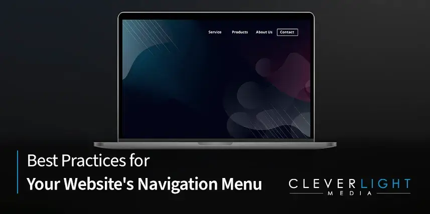
Although there are many ways to present your navigation menu, most websites have what developers call a “header”: a horizontal menu at the top of the page with a line of clickable elements. When employing a header or any other horizontally formatted nav menu, it is a good idea to incorporate your company logo into your design. This allows you to prominently display a powerful piece of your brand identity that doubles as a clickable link to your website’s homepage.
Less is More When it Comes to Your Nav Menu
The last thing you want to do is overcrowd your nav menu. By linking your home page to your logo, you can avoid cluttering your nav menu with a designated “home” tab. In fact, each tab on your nav menu takes up extremely precious real estate. In her article “The Essential Guide to Website Navigation,” HubSpot contributor Anna Fitzgerald reports that industry best practices limit the number of items on any nav menu to seven at most. Nav menus that are too big can become complicated to use and occupy too much space on your page. In addition to placing as few items as possible on your nav menu, you should designate these items with short, catchy titles rather than long, clumsy phrases.
Organization into Categories is Key
The handful of items on your nav menu must direct users to the information that they seek or the business that they want to conduct on your website. Therefore, it is advisable to divide your nav menu into broad categories such as “products” or “services.” When users click on these tabs, they can open a sub-menu of other clickable tabs that fall into the same general category. An “About” tab, for example, might lead to a sub-menu of items such as “Company Mission” and “Company History.” You may also want to draw attention to a CTA (call to action) button, such as “GET A QUOTE,” in your nav menu.
Ensure Your Nav Menu is Optimized for Mobile
The wide use of mobile devices makes a mobile-optimized website an absolute must for modern businesses. This might mean creating a secondary website nav menu for smartphone and tablet users. Consider the “hamburger” style nav menu, which features a three-line icon that opens a vertical drop-down or horizontal pop-out sub-menus when clicked.
For More Information
If you want to learn more about navigation menus or website design in general, contact CleverLight Media today!